
LinkedIn College Campaign
Branding I Design Sprint I UX Design
"Visualize a campaign that can explain the brand promise of LinkedIn to new college graduates. Market LinkedIn to the college crowd a manner find most compelling."
Proposed Solution
Creating a new landing page specifically for collage students will encourage a new audience to use LinkedIn. LinkedIn promotes an image that is very focused on professional networking, which is something students know they should prepare for but don't know how it relates to them before entering that environment. From the perspective of a second semester junior, looking for an internship, it would be nice to have a place with shortcuts to the resources a student needs.
Research

Questions from Carnegie Mellon Student Interviews;
- How does LinkedIn play a roll in your professional life?
- How did you hear about LinkedIn?
- As a college student, how do you feel about entering the professional world? How could LinkedIn help you?
- How could LinkedIn attract your attention?
- What is the difference between a collage and a professional atmosphere? What insecurities do you have about entering the professional world?
- How do you feel about moving from one environment to the other?
- Do you feel prepared to graduate?
Findings from 5 students
4 out of 5 shared these thoughts:
- Entering the professional world is scary and they do not feel prepared to graduate
- They heard of LinkedIn by word of mouth
- They use LinkedIn but they don't know how it benefits them
1 our of the 5 had extremely positive experiences with LinkedIn:
- She loved LinkedIn because it got her an investment banking internship in NYC
- LinkedIn spams too much and can be confusing
- The design is not college student friendly
Process
My first concept focused on both the senior college student about to graduate and a post graduation student. At this point in my process, I thought about the question “Now What?” and how these two types of people may need guidance in different but specific areas. However, for both college senior and graduate it is an awkward time for a student. They often found themselves questioning what to do next.
Phase I
I iterated on this concept and realized that as a campaign, it was not as effective as I had originally imagined. My UI was split in to two sides where users were forced to tailor themselves to one criteria or another...it also did not promote the right message. It did not convey the message I wanted.


Phase II Breakthrough
I went back to brainstorming and exploring new concepts. While doing so, I reflected back on my student interviews. One specific question I asked everyone was: How do you feel about moving from one environment to the other? And in doing so, I would always find myself following with, “How do you plan to bridge the gap between college and professional life?”


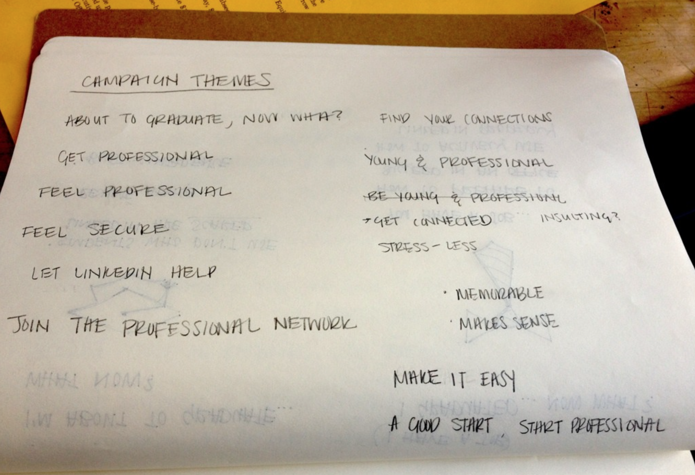
Exploration
I chose to keep the landing page simple. A clean UI thats visually pleasing conveys the feeling of ease. The landing page will promote the concept, “Bridge the Gap” and offer quick links tailored towards a college student or grad’s needs.
My focus links were:
- Find Your School
- Connect with Alumni
- Search Jobs and Internships


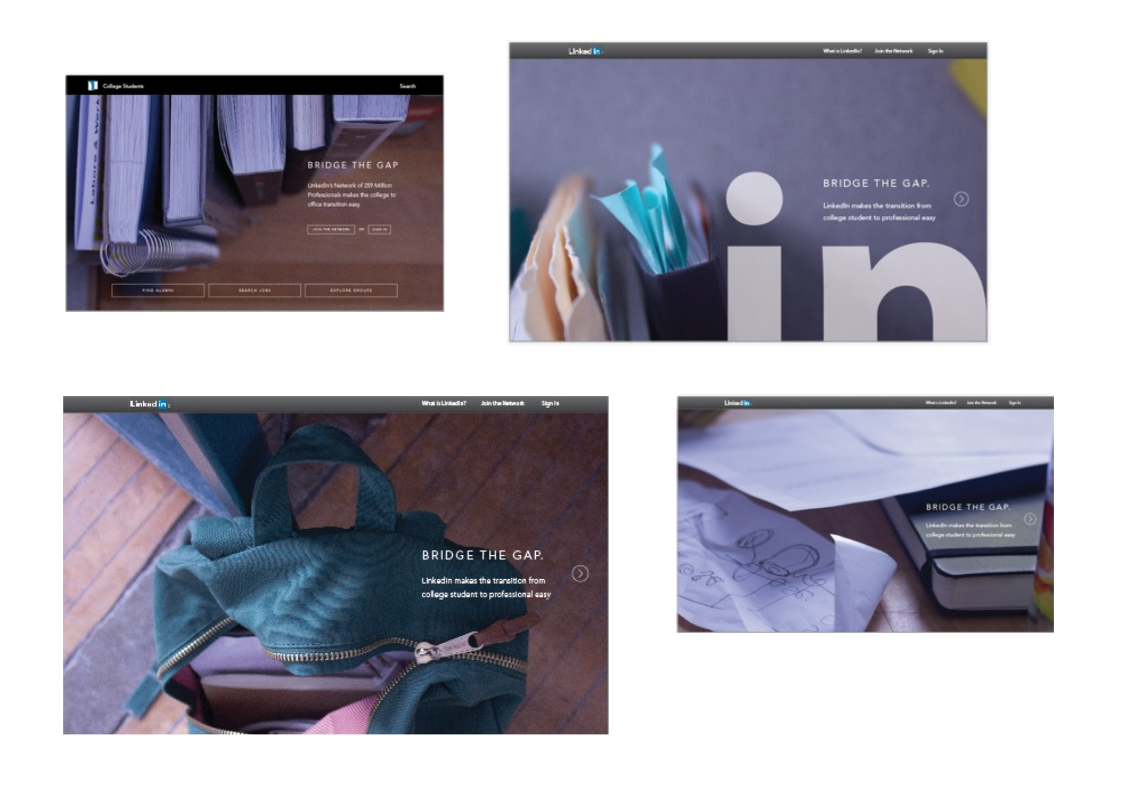


Imagery & Interaction
The photo used in the wireframe is there only to represent the style of photography. Initially I wanted to shoot macro images of environments that were college specific. For example, messy desks and books. I wanted the user to feel like they could relate to the images.
Final Direction
I then had the idea to juxtapose two behaviors or environments: college vs. professional. I pictured cleanly composed images of a backpack next to a briefcase or messy converse shoes next to shiny leather oxfords. I wanted to choose items that showed personality and seemed very human. The challenge with this was to make sure it didn’t look like it was promoting clothing or insulting a stereotypical college student. I chose to juxtapose content from a college student’s workspace with content used in an office job. I felt comparing these two things would really show both character and organization.


