
YouTube Studio Mobile
Product design • Design System
Company: YouTube
My Role: UX Lead for Studio Mobile Platform
Please email for more info
Overview
The Creator Studio Mobile app lacked design support for years before I joined the team. I scoped and implemented a redesign to update the app and better align it with YouTube standards. The was critical foundational work that enabled the app to house new features.
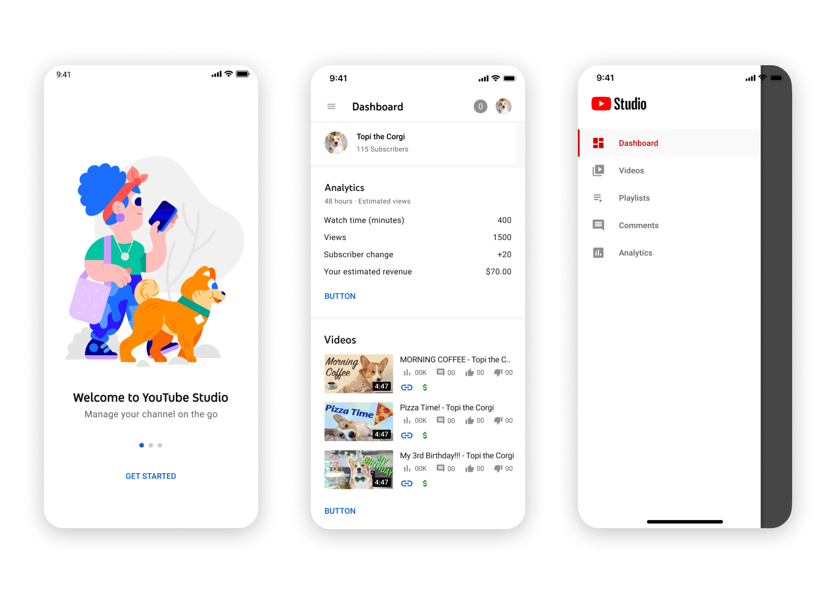
Design system
When I joined the team at the end of 2018, the Creator Studio mobile app lacked a design system and spec. In 2019 I designed, scoped, and implemented new typography, padding, and spacing in collaboration with my team’s visual designer. This improved user perception and unified the app with the desktop product.
(Right) The new app redesign in relationship to desktop.

Dark Mode
In addition, lack of dark mode was a top user complaint for Creator Studio. In addition to the refresh, we launched dark mode in 2020. It received a lot of positive feedback and is used currently by many users.
See below for before & after shots.

Before & after
The old design (left) followed styles form Material 1. It lacked branding and felt disjointed from YouTube’s suite of other products.
The new design (right) feels fresh, friendlier, and now has the ability to scale for new features.

Before (left) After (right)
